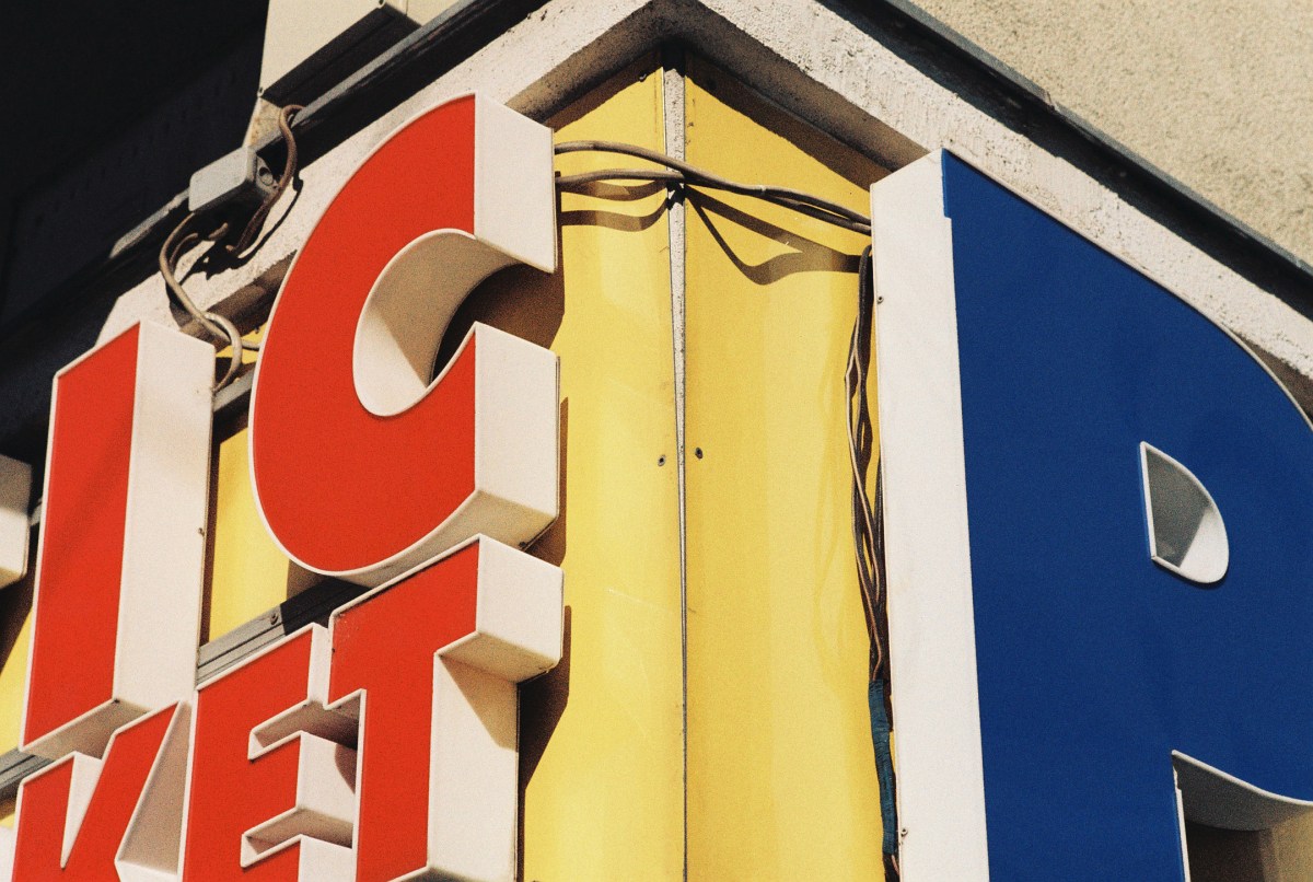
Some film stocks aim for accuracy. LomoChrome Classicolor aims for a feeling. Load a roll, shoot it in decent light, and your scans come back looking like they were pulled from a shoebox of 1970s family photos — amber warmth in the highlights, faded shadows that lean toward brown rather than black, and a color palette that feels like someone turned the nostalgia dial up without tipping into gimmick territory.
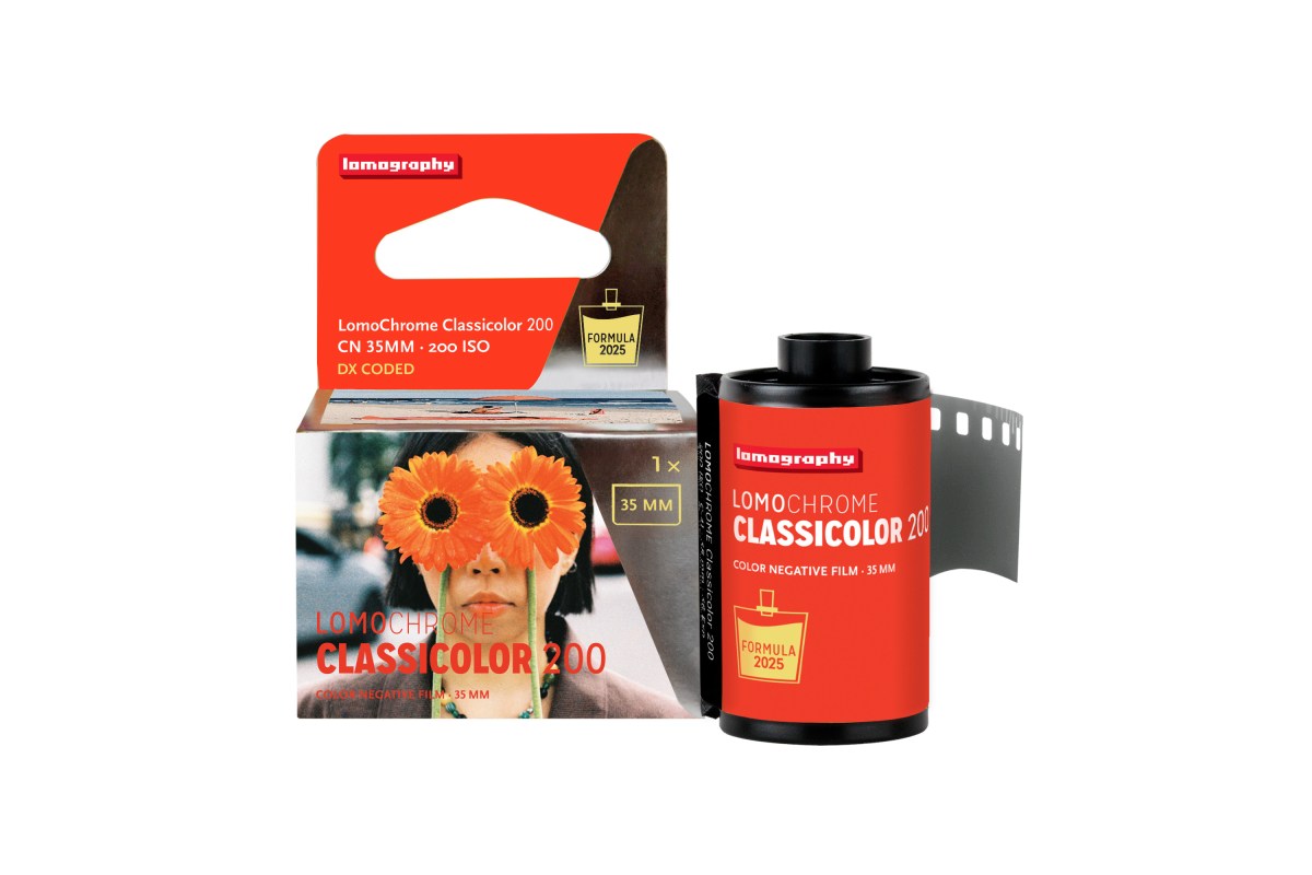
It's a specialty stock from Lomography, part of their LomoChrome line. ISO 200, standard C-41 processing, available in 35mm and 110 format. The look is distinctive enough to be worth seeking out, and accessible enough that any lab on the planet can develop it.
Your scans come back looking like they were pulled from a shoebox of 1970s family photos — amber warmth in the highlights, faded shadows, and a color palette that feels like pure nostalgia.
The LomoChrome Family
Classicolor sits alongside two siblings in Lomography's LomoChrome range. LomoChrome Purple shifts colors toward purple and magenta — greens turn lavender, skies go pink, and the results look alien in the best way. LomoChrome Metropolis desaturates everything into cool, muted tones with a cinematic, overcast mood. Both are striking, but they're statement films. You use them when you want the stock itself to be part of the story.
Classicolor is the subtler choice. The color shift is real and unmistakable, but it doesn't overpower the subject. You can shoot portraits on it and people still look like themselves — just warmer, softer, like the light remembers a better decade. That restraint is what makes it usable for more than just experimental projects.
Color Palette and Grain
The dominant shift is toward amber and gold. Highlights take on a warm cast that's reminiscent of aged print paper or a tungsten-lit living room. Greens are muted rather than vivid — grass and foliage look olive-toned, almost faded, which contributes heavily to the retro character. Shadows warm up too, pulling toward brown and sepia rather than staying neutral.
Blues hold up reasonably well, which keeps the images from feeling monochromatic. A clear sky will still read as blue, just a softer, more muted blue than you'd get from Portra or Gold. The overall effect is a slight cross-processed look, but gentler and more controlled than actual cross-processing.
Grain is moderate. Finer than you'd expect from a Lomography stock — closer to mainstream films like Kodak Gold than to the more experimental Lomo emulsions. At ISO 200, the grain structure is tight enough for clean scans but present enough to reinforce the analog feel. You won't mistake it for a digital filter, and that's the point.
Now in 110 Format and the Simple Use Camera
Classicolor was originally a 35mm-only stock. Lomography has since expanded availability to 110 format, which is great news if you shoot any of the compact 110 cameras that have found a second life in the analog revival. The tiny negatives pair well with Classicolor's aesthetic — the visible grain and warm tones suit the lo-fi format.
The easiest way to try Classicolor without committing to a full roll in your main camera is the Lomography Simple Use camera. At $27.90, it comes pre-loaded with a roll of Classicolor and ready to shoot out of the box. The camera itself is a basic fixed-focus plastic body with a built-in flash, but it gives you 36 frames of Classicolor to evaluate the look before buying standalone rolls. Think of it as a sample pack.
Shooting Tips
Classicolor performs best in good light. At ISO 200, it wants daylight — sunny, overcast, or open shade all work well. Where the stock truly glows is golden hour. The warm tones in the emulsion amplify the warm tones in the light, and the results can be genuinely stunning. Late afternoon sun on skin, on old buildings, on dusty roads — everything turns to gold.
Slight overexposure (half a stop to one stop) helps. The highlights open up and the warmth spreads, giving you that creamy, faded quality the stock is known for. At box speed the images can lean slightly dense in the shadows. Overexposing brightens the shadow tones and lets the amber cast come through more evenly across the frame. If your camera has manual ISO, try rating it at 100 instead of 200.
Avoid tungsten and fluorescent indoor lighting unless you're deliberately chasing a heavily shifted look. The film's warm bias compounds with warm artificial light and you can end up with images that are overwhelmingly orange. Daylight, window light, and flash all produce more balanced results.
How It Compares to Kodak Gold and ColorPlus
Kodak Gold 200 is the obvious comparison — same speed, similar warm personality, both popular for casual and travel shooting. The difference is intention. Gold is warm but aims to be a general-purpose film. The warmth is a characteristic, not the entire point. Colors are saturated and punchy. Greens are green. Blues are blue. It looks like “film” in the way most people imagine film.
Classicolor commits harder to the aesthetic. The color shifts are deliberate and consistent — every frame has that amber-toned, faded quality. Gold gives you a pretty picture. Classicolor gives you a pretty picture that looks like it was taken 40 years ago. Whether that's better depends entirely on what you're after.
Kodak ColorPlus 200 is cheaper than both and has a more neutral palette. It's the budget baseline. Classicolor costs more per roll, but you're paying for a specific look that you can't replicate by slapping a preset on a ColorPlus scan. The warmth is baked into the emulsion, and it interacts with light differently than any digital filter can simulate.
Processing — Standard C-41, No Special Treatment
Despite the specialty look, Classicolor uses standard C-41 chemistry. Any lab that processes regular color negative film can handle it. You don't need to find a specialist, you don't need to give special instructions, and you don't need to pay extra for unusual processing. Drop it off like any other roll.
If you're not sure where to find a reliable lab near you, Pellica's lab map lists over 500 film development labs worldwide, filterable by the services they offer. C-41 is the most common process, so you'll have plenty of options. A good lab with careful scanning will preserve the warm tones and shadow detail that make Classicolor worth shooting.
Track Your Classicolor Experiments
Specialty stocks reward careful tracking even more than mainstream films. With Classicolor, you'll want to know exactly how different lighting conditions affected the color shift, whether overexposure gave you the look you wanted, and how the stock handled specific subjects. That kind of data turns a single roll of experimentation into lasting knowledge.
Use Pellica's film roll tracker to log your Classicolor rolls frame by frame. Record your exposure settings, let the app capture GPS and weather automatically, and add notes about the light and your intentions. When your scans return from the lab, import them and match each image to its data. After two or three rolls, you'll know exactly how to get the most out of this stock — and you'll have the metering data to prove it.