Everyone can spot a film photograph. There's something about the tonality, the grain, the way highlights bloom and colors sit together that screams analog. Instagram filters try to approximate it. Lightroom presets claim to replicate it. Digital cameras now ship with “film simulation” modes built into their firmware. And yet none of them quite get there. The gap between a real film image and a digital approximation is immediately obvious to anyone who has spent time looking at both.
That gap isn't nostalgia, and it isn't placebo. There are concrete physical and chemical reasons why film looks the way it does — reasons rooted in optics, materials science, and photochemistry. Understanding them won't just satisfy your curiosity. It'll help you choose the right film stock for the look you want, and explain why certain digital emulations fall short.
Grain vs. Noise: Organic Randomness vs. Pixel Artifacts
Film grain is created by silver halide crystals embedded in the emulsion. During development, exposed crystals reduce to metallic silver, forming clumps of varying size and density. Their distribution is random and organic — no two grains match. Grain follows the image content: denser in the midtones and shadows, finer in the highlights. It has a three-dimensional quality because crystals exist at different depths within the emulsion layers.
Digital noise is caused by thermal and electrical fluctuations in the sensor's photodiodes, amplified at higher ISOs. It manifests as uniform, pixel-level variations on the fixed grid of the sensor. It lacks the dimensional, content-following quality of physical crystals. Noise reduction algorithms can suppress it, but they smear fine detail, producing the waxy look of aggressive denoising.
Our visual system responds differently to these textures. Grain reads as richness — like the weave of canvas in a painting. Noise reads as degradation. Studies in visual perception confirm that irregular, organic patterns are processed differently from regular, grid-aligned ones. The brain accepts grain as part of the image. It flags noise as something wrong with it.
Grain is perceived as texture — like the weave of canvas in a painting. Noise is perceived as degradation. Our brains process them differently because they are physically different phenomena.
Halation: The Glow That Can't Be Faked
Halation is the soft glow that appears around bright light sources and high-contrast edges in film photographs. It happens because light passes through the emulsion, hits the film base, and bounces back into the emulsion from behind. This scattered, reflected light exposes the surrounding area, creating a diffused halo around the bright point.
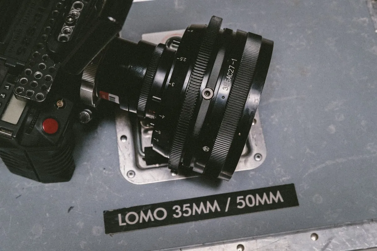
Most film stocks include an anti-halation layer — a dark coating on the back of the film base that absorbs transmitted light and minimizes the bounce-back. But it doesn't eliminate halation entirely, especially with strong light sources. And some stocks deliberately lack this layer. CineStill 800T, for example, is Kodak Vision3 cinema film with the remjet anti-halation backing removed for C-41 compatibility. The result is pronounced red-orange halation around streetlights, neon signs, and any bright point source — the signature CineStill glow that has made it one of the most distinctive film stocks available.
Digital sensors don't produce halation. Light hits the photodiode and is absorbed or reflected, but there's no secondary exposure from behind. You can approximate halation in post-processing with bloom effects and masked blurs, but the result looks applied rather than inherent. Real halation interacts with the specific tonal values and spatial frequencies of the image in ways that a uniform bloom filter cannot replicate.
Color Response Curves: S-Curves vs. Linear Capture
This is arguably the most important technical difference between film and digital, and it affects every pixel of every image.
Film has a non-linear response to light. The relationship between exposure and density follows an S-shaped curve (the Hurter-Driffield curve, or H&D curve). In the shadows (the “toe” of the curve), density builds slowly — the film compresses shadow tones, which is why underexposed film looks muddy rather than just dark. In the midtones, the response is roughly linear and proportional. In the highlights (the “shoulder”), density tapers off gently — the film compresses highlights, rolling them off smoothly into white rather than clipping abruptly.
This highlight rolloff is the single biggest visual contributor to the “film look.” When a bright window, a patch of sky, or a reflective surface exceeds the film's range, the transition into overexposure is gradual and pleasing. Detail fades smoothly. Colors desaturate gently. The image retains a sense of luminosity even where information is technically lost.
Digital sensors are linear. Each photodiode converts photons to electrons proportionally until it reaches full well capacity, at which point it clips — hard, abruptly, with no transition. Blown highlights on digital go from detailed to pure white in the span of a fraction of a stop. The visual result is harsh and unforgiving, which is why digital photographers obsess over protecting highlights in ways that film shooters rarely need to.
Dynamic Range Distribution
Both film and digital have usable dynamic range, but they distribute it differently — and this has profound consequences for exposure strategy.
Color negative film has significantly more latitude in the highlights than in the shadows. You can overexpose Portra 400 by three stops and get beautiful, usable images with smooth tones and saturated colors. Overexpose by four stops and it's still printable. Underexpose by two stops and the shadows go thin and grainy, with muted colors and visible noise. This is why experienced film photographers default to overexposure — the film handles it gracefully in the direction where digital would fall apart.
Digital sensors have more latitude in the shadows. Modern raw files can recover three or four stops of shadow detail with minimal degradation. Highlights, though, clip hard and cannot be recovered once lost. This asymmetry is the opposite of film, and it drives the opposite exposure strategy: digital photographers expose to protect highlights, trusting that shadows can be lifted in post.
The practical consequence is that film and digital render the same high-contrast scene differently even when both capture similar total dynamic range. Film preserves the bright areas and lets the shadows go. Digital preserves the shadows and clips the brights. Neither is objectively better, but the film approach tends to produce images that feel more natural to the eye, because the human visual system also compresses highlights more gracefully than shadows.
Color Coupler Layers: Chemistry as Color Science
Color negative film achieves color reproduction through three superimposed emulsion layers, each sensitive to a different part of the spectrum: red, green, and blue. Within each layer, color couplers — chemical compounds incorporated into the emulsion during manufacturing — react with the oxidized developer during processing to form dye. The cyan layer forms from the red-sensitive emulsion, the magenta from the green-sensitive, and the yellow from the blue-sensitive.
The specific coupler formulations are what give each film stock its unique character. Kodak Portra uses couplers designed to render skin tones with warmth and accuracy. Kodak Ektar uses couplers that maximize saturation and color purity. Kodak Gold uses different couplers yet again, producing its characteristic warm, nostalgic palette. These aren't just different “profiles” that could be swapped in software. They're fundamentally different chemical reactions happening at the molecular level, with complex interactions between layers that depend on the spectral content of the light hitting the film.
This chemical complexity is also why two different film stocks produce visibly different images from the same scene under the same light. The coupler interactions, the relative sensitivities of each layer, the cross-layer effects — all of it contributes to a color response that is genuinely unique to each emulsion and impossible to replicate exactly through digital color grading.
The Orange Mask
Hold a developed C-41 negative up to the light and you'll see a strong orange tint. This isn't a flaw — it's a deliberate engineering choice called the integral mask. The cyan, magenta, and yellow dyes formed during development aren't spectrally perfect; each absorbs light outside its intended range. The orange mask compensates by incorporating colored couplers that cancel out these dye impurities across the tonal range. Scanners and enlargers account for it in calibration, and the result is more accurate color than uncorrected dyes could produce.
Reciprocity and Non-Linearity
At very long exposures, film stops behaving predictably. Reciprocity failure occurs because the photochemical reaction isn't perfectly efficient at extreme durations — a metered 10-second exposure might require 30 or 40 seconds of actual exposure. Each emulsion layer fails at a slightly different rate, producing color shifts toward green or magenta depending on the stock.
Digital sensors have no reciprocity failure. Ten seconds captures ten seconds of light, linearly. That predictability is practical, but it also means digital lacks the unique tonal shifts and color anomalies that give long-exposure film its surreal, distinctive quality.
Why Digital Film Simulations Fall Short
Fujifilm's simulation modes (Classic Chrome, Nostalgic Neg), Lightroom presets, third-party LUTs — all apply color transforms and tone curves to data captured linearly by a silicon sensor. They approximate the output but cannot reproduce the process. The grain is synthesized, not formed by crystals. The highlight rolloff is mathematically modeled, not optically inherent. The color interactions between layers are lookup tables, not chemical coupler reactions. The halation, the reciprocity effects, the light scattering through a physical emulsion — none of it is happening.
At a glance, the best simulations get close. Pixel-peep the grain, examine how highlights transition to blown, compare skin tones across lighting conditions, and the gap widens. Digital emulations are color grades applied to digital data. Film is a different medium responding to light through different physics. The distinction is irreducible.
Using This Knowledge
Understanding why film looks different isn't just academic. It directly informs your creative choices. If you want smooth highlight rolloff in a backlit portrait, film's S-curve response gives you that natively. If you want the glow of halation in nighttime city scenes, CineStill 800T delivers it physically. If you want grain that adds texture rather than degradation, the silver halide crystals in Tri-X or HP5 provide exactly that.
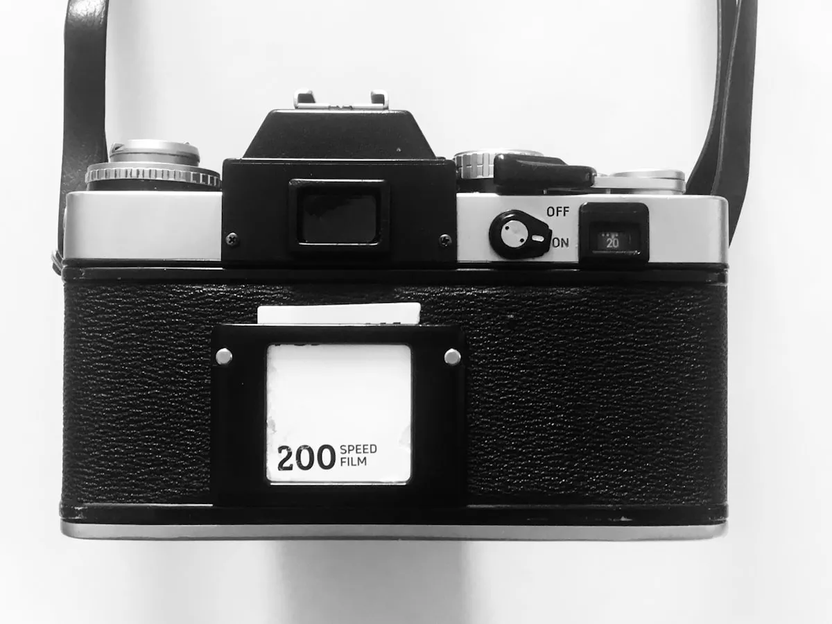
Tracking what you shoot — which stock, which lighting conditions, which exposure choices — lets you build a personal reference for how these physical properties translate into your specific images. Pellica's film roll tracker connects each frame to its settings, so when a scan comes back with that perfect halation glow or that gorgeous highlight retention, you know exactly how to reproduce it. Pair that with the light meter for precise exposure control, and you stop guessing at what made a particular shot work. The science is in the emulsion. Your job is to learn how to use it — and to remember what works when you find it.